Member Experience
MBS (Medical Benefits Statement)
Overview
Role: Lead Content Designer
Team: Product Designers (Casey Kawahara and Jess Bronson), Product Manager (Ashley Chang)
Timeline: 30 days
The MBS (that’s Medical Benefits Statement in our world) is Collective Health's answer to the traditional EOB (that’s Explanation of Benefits in the biz). Except, it still presented challenges to our members: they thought it was a bill, and it was driving inquiry volume like mad. Between 11/11/2017 - 11/11/2018, 4% of our calls—aka 4000 individual inquiries!—were specifically about this lil’ piece of paper.
And user research confirmed all this, and more. Member quotes included:
“I view it as a monthly statement, like my credit card...which I might have made up.” (Eek, that’s not quite right!)
“An MBS comes at the end of the year, right?” (Alas, no.)
“I don’t know what an MBS is.” (Fair. I didn’t either until I worked at Collective Health.)
Problem
Due to some truly wonky backend code that would take actual months to untangle, we couldn’t completely redesign the MBS in a “quick win” fashion. Which meant music to my ears, because it was content’s time to shine. Instead of reimagining the artifact entirely, we could only play with the words. While not ideal, I love this kind of challenge. (#wordnerd)
Process
I was handed the MBS, and after reviewing the completely confusing pile of words and big scary numbers in front of me, I had to ask: what context do members get before they see this info? That’s when I got to feast on the email we were sending to direct folks to the MBS.
No wonder there was an issue with member understanding. The context was murky (what is “care activity” exactly?) and the not-bill looked frankly, like a bill.
First Exploration
We first explored what it might feel like to clarify what members were receiving via email by answering the big question, Um, what is this? in the headline, and adding lots of context to the MBS itself. The split level context setting was my idea to draw the eye down the page in a way that would tell members what this thing was, and what to do with it.
Second Exploration
In our next exploration, we moved the context into the email—burying the answer to “what is this?” didn’t feel right, and user testing told us that was correct. We played with adding lots of content to the footer of the MBS itself, but found it was getting lost as members tried to take in that big number under Your Responsibility.
Third Exploration
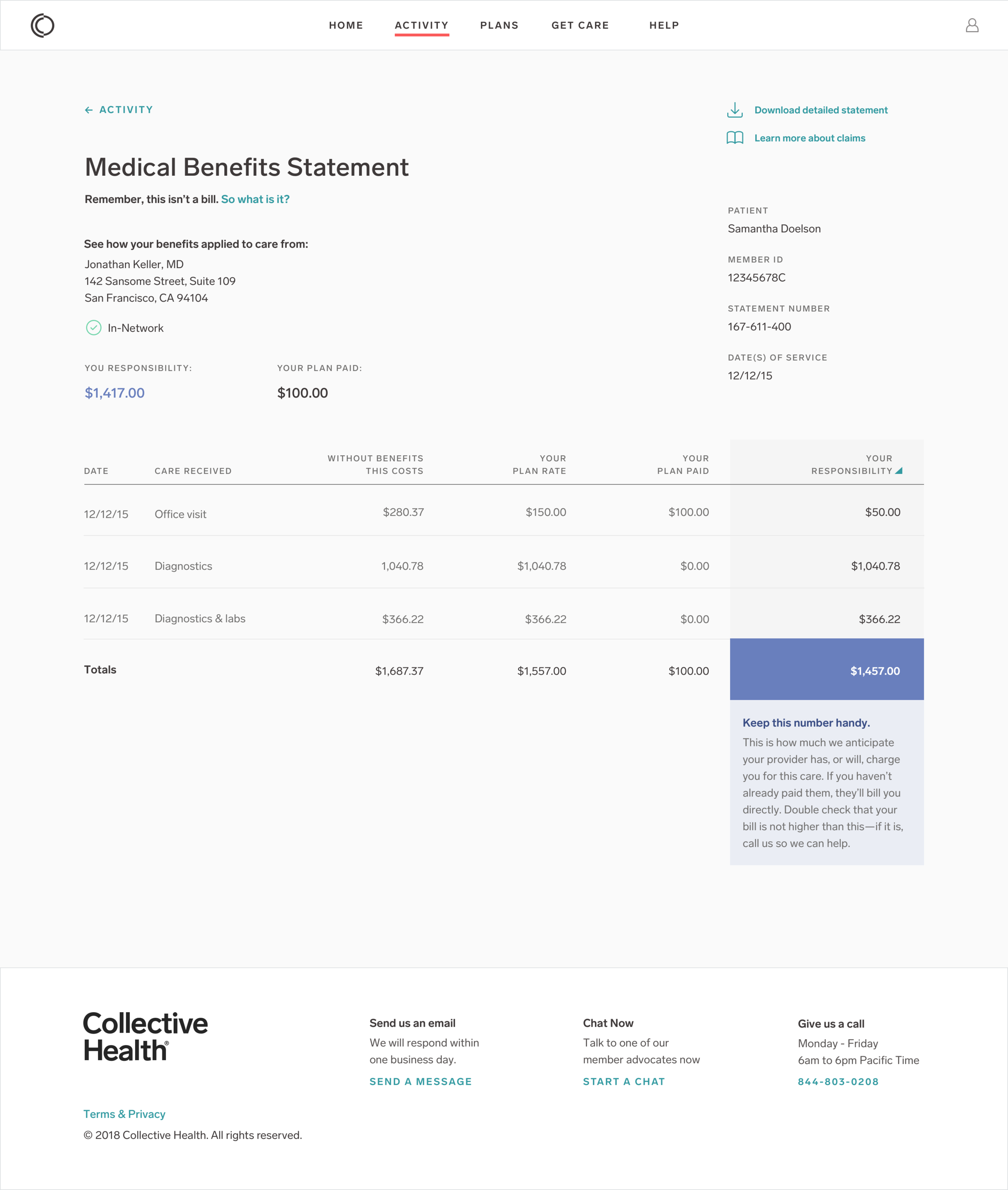
I love giving people the opportunity to learn more if they want to, and we’d just launched a Help Center mere weeks before this project was going live. So, we could leverage that to give extra context to the MBS itself, and focus our energy on helping people understand what they should do with the MBS. Check out that blue box in the bottom right of the statement.
Final Product
Our final product had a few key changes. The email set the context of why they were receiving a statement, what the statement was about, and what to do next. The MBS itself reiterated what it was, and put emphasis on what to do with the statement—which is pretty simple, actually: make sure it check out against the amount your provider bills you.
Impact
We tracked the impact of the MBS updates for a full year. Between 11/11/2018 - 11/11/2019, 2.7% of our calls (aka less than 3000 individual inquiries) were specifically about MBS—plus, our member base grew by 50% in that time!
Definitely daydreaming about the day we get to create something truly member-friendly through a reimagining of this key touchpoint.


