Member Experience
COB (Coordination of Benefits)
Overview
Role: Lead Content Designer
Team: Product Designer (Tal Benisty, Jess Bronson), UX Researcher (Courte Owyang) Product Manager (Ashley Chang)
Timeline: 3 months
Say “COB” to anyone in the insurance industry, and nine times out of ten they’ll shudder. Coordination of benefits is a complicated mess dictated by arcane and somewhat arbitrary rules that are challenging for an expert to grasp, let alone a layperson just trying to have medical coverage. (Ask me about the birthday rule. I dare you.)
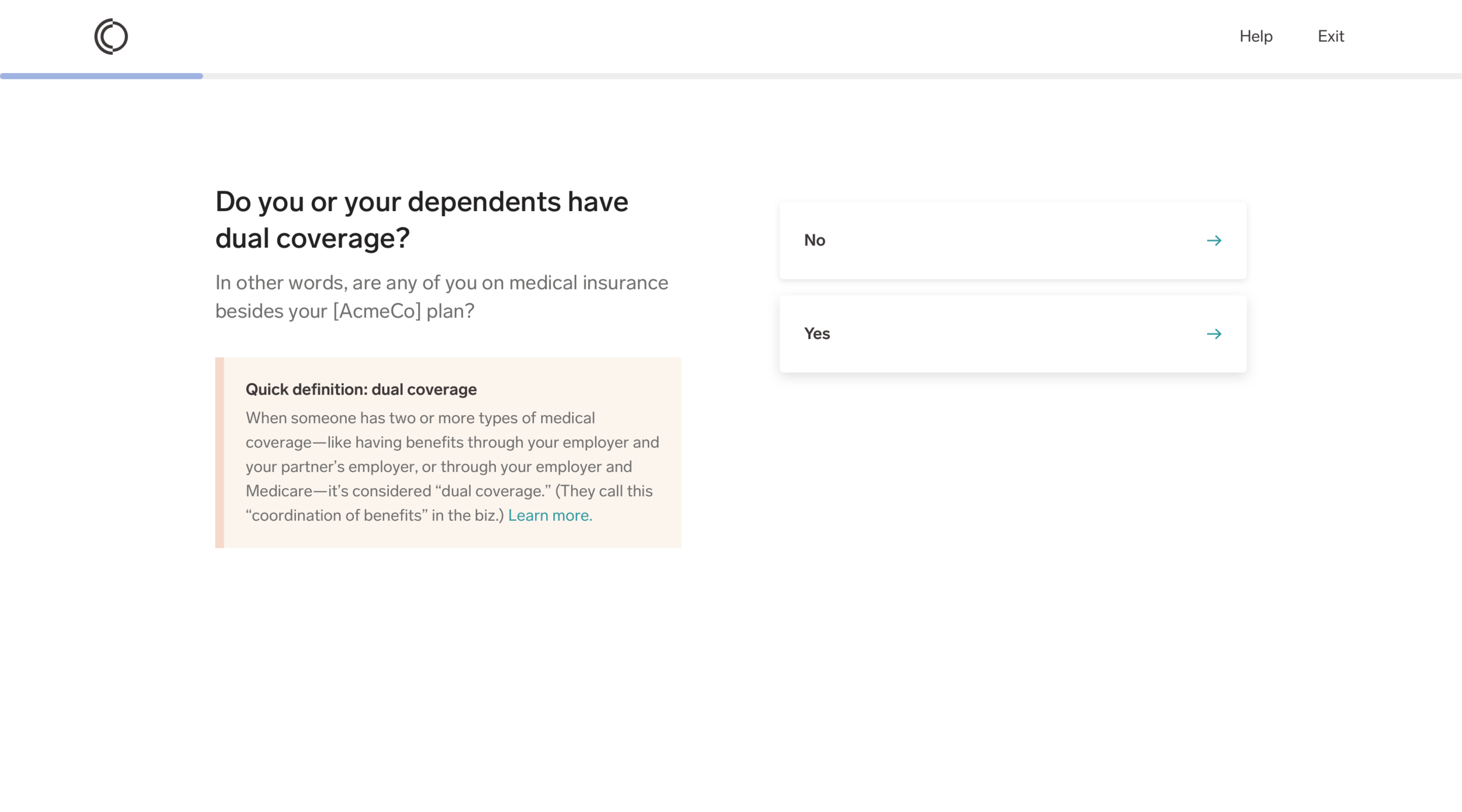
Here’s what you need to know: coordination of benefits, or COB, is what takes place if someone is covered by more than one medical plan (like, if you have benefits through a job, and your partner has benefits through a different job, and you both cover your child).
Problem
Our internal ops team needed to know when a member had more than one type of coverage. They were using a manual process to figure it out. They’d start to process a claim, realize it might “need COB”, then reach out to the member and ask them to fill out a form. With 2250+ members having COB, and each form taking the MA five minutes to manually input, they were spending 187 hours on that alone...and our member base was growing (yikes).
We were tasked with creating an in-product solution that got members to self-identify as having multiple types of coverage, and giving us the details of that coverage.
Process
The designers and I hit the whiteboard hard, with daily sessions to try and parse out what the heck coordinating benefits meant from an internal standpoint, and how that differed from a member point of view. We also went on a fact-finding mission, interviewing internal subject matter experts to help us grasp the finer points.
Without much to go off of, we worked on refining the experience through low-fidelity mocks and fast iterations based on internal critique sessions. We soon moved to user testing to see how our solution was working in the real world.
Our rapid testing shaped our thinking, and evolved our solutions—and were especially helpful in terms of content. Intuitively, I could guess where we’d need additional context or not. But sometimes I was surprised, and the user testing gave me confidence in the choices I was making.
One key area testing informed was help text. We found members often wanted to know “why are you asking this?” Info necessary for coordination of benefits is pretty personal, and can even rile up emotions (see: question about child custody).
Also, the flow itself is long. Reminding members why completing this flow mattered to them (“to make sure you’re billed correctly”) gave them a compelling reason to keep going.
Creating fresh, informative content with so many nuances to juggle wasn’t easy. But I was determined to infuse moments of, well, if not delight, then levity, into the flow to make it less tedious. With the support of the designers, I seized opportunities when I saw them, and they helped make the content sparkle rather than sag. Especially proud of that Abbott and Costello reference.
Final Product
The final flows had several variations, based on use case and edge case (pretty sure we had a literal bajillion edge cases to cover). This movie shows the longest case:
Impact & Reflection
As it turns out, we were not in lockstep with our eng capabilities throughout this build. Once we handed over the final designs, they had to say “Actually, our data sets won’t allow us to capture and apply this information.” That was a hard day...actually a hard week. We’d put months of creativity, brainpower, testing, and craft into this work, and to have it dissolve into thin air was sad.
We learned a lot: as dev org, it was clear where in our product dev process we needed to improve. But also just about how to work together, and how simplifying health benefits stuff could be done. That’s important.


